Your homepage does not need to tell the entire story of your business in the first screen.
It does need to orient a new visitor quickly enough that they can decide where to go next.
The homepage has an orientation job
Unlike a tightly focused landing page, a homepage often serves several visitor types. One person may be ready to buy. Another may want to understand the business. Another may be looking for free information, support, or a specific category.
The homepage should make those paths understandable without becoming a wall of competing messages.
Start with four questions
A new visitor should be able to answer:
- What does this business offer?
- Who is it for?
- Why might it matter to me?
- What should I do next?
If those answers are buried under vague slogans, jargon, or oversized branding, clarity suffers.
Write the hero around the main promise
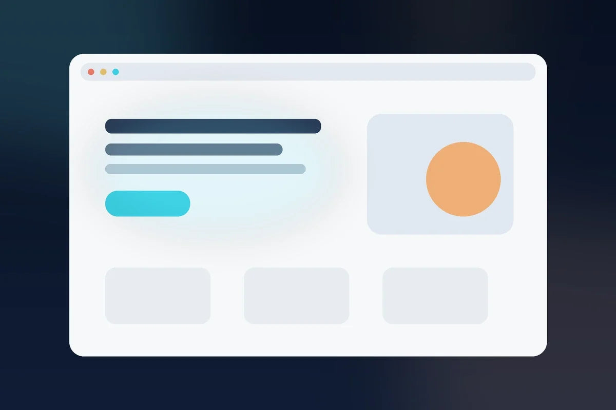
Your hero section usually needs a clear headline, a short supporting explanation, and a primary next step.
Weak: “Unlock Your Potential.”
Clearer: “A connected marketing system for small-business owners who are tired of rebuilding their strategy from scratch.”
The clearer version may not be perfect for every brand, but it tells the reader much more about the offer and the problem it addresses.
Explain what the visitor can find here
After the hero, help people understand the major paths. Depending on the business, that might include:
- the main product or service
- free resources
- how the process works
- who the business serves
- proof or examples
- common questions
Do not force every visitor through the same route if the homepage serves multiple legitimate needs.
Translate features into value
A homepage full of feature names can still leave visitors wondering why they should care.
Whenever you name a feature, ask: What does this help the customer understand, avoid, save, improve, or accomplish?
If the underlying offer is still difficult to explain, use How to Make Your Offer Clearer.
Use visual hierarchy to support the copy
Important information should look important. Headlines, spacing, sections, buttons, and imagery should help a visitor scan the page.
When every block uses the same visual weight, the reader has to do extra work to decide what matters.
Add trust where uncertainty appears
Do not dump every trust signal into one giant section at the bottom. Place relevant proof near the decision it supports.
For example:
- a secure-payment note near purchase actions
- a real product preview near the offer
- delivery information near a digital product
- clear policies near a high-risk decision
- real testimonials only when you actually have permission to use them
Use How to Build Trust on a Small-Business Website Without Fake Testimonials for more options.
Give the homepage one dominant next step
You can have secondary links, but one action should usually receive the strongest emphasis. Depending on the business, that may be shop the main offer, book a consultation, explore the free library, or start with a specific service.
Use Website Calls to Action to choose the primary action.
Do not make the homepage do the product page’s job
The homepage can introduce the main offer, but a complex purchase usually deserves a dedicated product or sales page where the customer can evaluate details, fit, delivery, objections, price, and FAQs.
Read Homepage vs. Landing Page vs. Product Page.
A homepage clarity checklist
- The business category or offer is understandable.
- The priority customer can recognize themselves.
- The main value is stated in plain language.
- The primary CTA is visually obvious.
- Major visitor paths are organized.
- Trust information is credible and relevant.
- Mobile users can scan and navigate the page.
- No important button leads to the wrong destination.
Measure behavior before rewriting everything
If visitors are reaching the homepage but not moving deeper, investigate the source of traffic, mobile experience, clarity, competing paths, loading issues, and CTA visibility before assuming a new headline will solve the problem.
For the full diagnostic sequence, use the Website Conversion for Small Business hub.
A strong homepage does not make the visitor admire how clever the copy is. It helps the visitor understand where they are, why the business may be relevant, and what to do next.