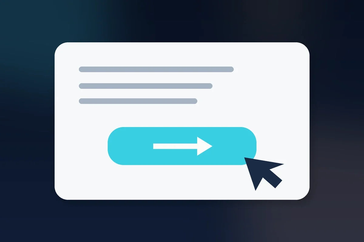
A call to action is simply the next step you want the visitor to take. The mistake many small businesses make is treating every page like it should immediately ask for the sale.
Good conversion is not about adding more buttons. It is about making the next useful step obvious.
If you want the big picture first, start with Website Conversion for Small Business: A Beginner’s Guide.
Start with the job of the page
Before writing the button, decide what the page is supposed to accomplish.
A homepage may need to route visitors. A product page may need to help someone buy. A blog post may need to move a reader toward a related guide, email signup, or offer. A landing page may need one focused conversion.
If you are unsure which page type you need, read Homepage vs. Landing Page vs. Product Page.
Match the CTA to the visitor’s stage
Someone who just discovered your business may not be ready for the same action as someone comparing your offer with alternatives.
Early-stage CTAs might include:
- Read the guide
- See how it works
- Explore the library
- View examples
- Join the email list
Later-stage CTAs might include:
- Buy now
- Start here
- Choose your plan
- Book a call
- Download the product
The best CTA is not necessarily the most aggressive one. It is the one that makes sense next.
Use clear language
Buttons such as “Submit” or “Learn More” can work, but they often hide the outcome. Whenever possible, tell the visitor what the click does.
“See what’s included” is clearer than “Learn more.” “Start the free guide” is clearer than “Continue.” “Get the template” is clearer than “Submit.”
Do not make five actions compete
A page with too many equally loud CTAs creates decision friction. If everything is highlighted, nothing feels prioritized.
Choose one primary action. Secondary actions can still exist, but they should look and feel secondary.
For example, a product page might use “Get the Suite” as the primary CTA and “See what’s inside” as the secondary CTA.
Place the CTA after enough context
A CTA should appear when the visitor has enough information to understand the action. That does not mean you must hide the button until the bottom of the page. It means the page should support the button.
On a long page, repeating the same primary CTA at natural decision points can be helpful. Avoid changing the wording so much that the visitor thinks each button does something different.
Reduce uncertainty around the click
Sometimes the button is fine, but the visitor does not know what happens afterward.
You can improve clarity by adding a short line near the CTA:
- Instant digital access after checkout
- No subscription required
- Takes about two minutes to set up
- You can unsubscribe anytime
Only use statements that are accurate for your business.
Make the CTA visually obvious
The primary button should be easy to see without forcing the visitor to hunt for it. Check contrast, spacing, mobile size, and whether another element steals more attention.
This is part of reducing friction, which you can explore in How to Reduce Website Friction Before You Rewrite the Copy.
A practical CTA test
For every important page, ask:
- What job is this page doing?
- What does the visitor likely know at this point?
- What is the single most useful next step?
- Does the button say what will happen?
- Is the primary action visually obvious?
- Have I removed competing actions that do not belong here?
Bottom line: the strongest CTA is a clear bridge between the page the visitor is on and the next step that makes sense.