Visitors should not have to solve a puzzle before they can understand your business.
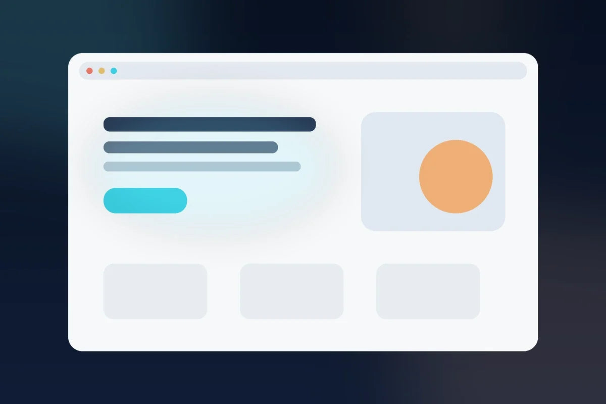
The top of a homepage or product page—the first screen a visitor sees before much scrolling—cannot explain everything. But it should establish enough clarity for the right person to decide whether to keep reading.
Set a timer for ten minutes and run this test.
Quick answer: what should the first screen of a website communicate?
The first screen should help the right visitor quickly understand what you offer, who it is for, the main problem or outcome, and what to do next. A clear visual, believable proof point, or product preview can strengthen the message, but the visitor should not need to decode the page before deciding whether to continue.
Minute 1: Can I tell what is being offered?
Hide the logo if necessary and read only the headline and supporting copy. Is the offer a service, product, software tool, course, template pack, membership, or something else?
Creative headlines can be memorable, but they should not force visitors to guess the category.
Minute 2: Can I tell who it is for?
The page does not need to exclude everyone else, but the intended buyer should recognize themselves. “Grow your business” says almost nothing. “A connected AI-assisted marketing system for entrepreneurs and small businesses” gives the visitor more context.
Minutes 3–4: Is the main problem or outcome clear?
Can the visitor understand why the offer exists? Focus on one primary problem or outcome before listing fifteen features.
If the message changes from “save time” to “grow traffic” to “build a brand” to “automate everything” in the same screen, clarity usually suffers.
Minute 5: Is there an obvious next action?
The main button should tell the visitor what happens next: view the suite, see what is included, start the guide, shop now, book a call, or another appropriate action.
A page with five equal CTAs forces the visitor to make a navigation decision before they have made a buying decision.
Minute 6: Is there a believable reason to keep reading?
A short proof point, product visual, workflow preview, or clear benefit can reassure the visitor that there is substance below the fold. Do not use fabricated counters, reviews, awards, or performance claims.
Minute 7: Does the visual reinforce the message?
If your headline says “one connected marketing system” but the visual looks like a stack of unrelated worksheets, the design creates a different story than the copy. The first screen should visually support the positioning.
Minute 8: Remove one thing
Choose the least important badge, sentence, button, icon, or decorative element and temporarily remove it. Does the message become easier to understand? Simplification is often a conversion improvement before rewriting everything.
Minute 9: Check the mobile first screen
Mobile visitors may see only the headline, part of a paragraph, and one image. Verify that the key message and CTA do not disappear under oversized graphics or awkward spacing.
Minute 10: Ask someone unfamiliar with the business
Show the first screen for a few seconds, then ask: “What do you think this business sells, who is it for, and what would you click next?” Do not coach them. Their confusion is useful information.
For a deeper product-page framework, see How to Write a Product Page That Answers Buying Questions.
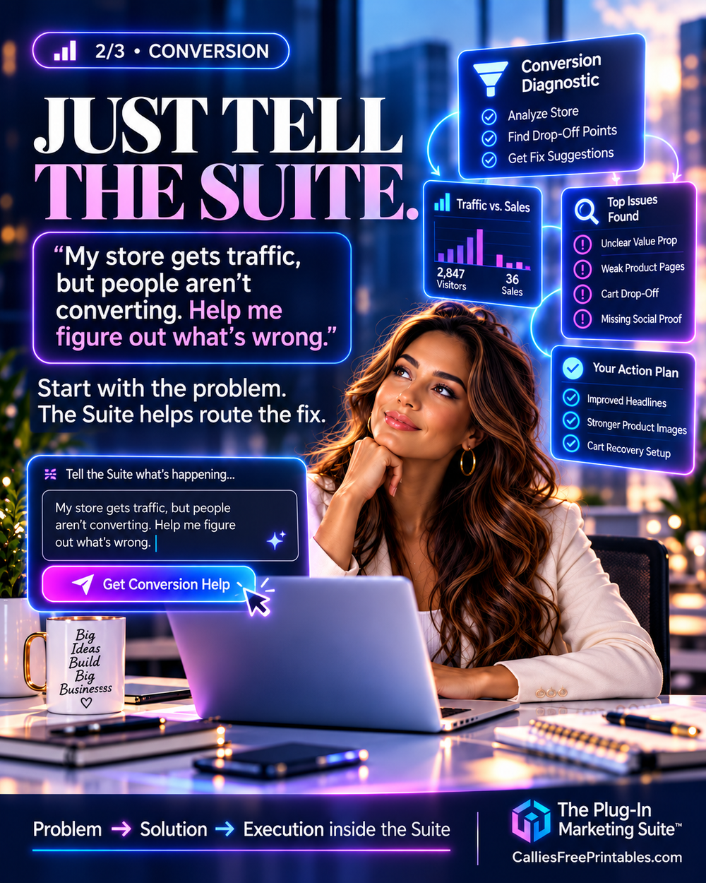
A prompt you can give The Plug-In Marketing Suite™
“Audit the first screen of this homepage or product page using my Business Knowledge Base and offer details. Check whether it clearly communicates what I sell, who it is for, the primary problem or outcome, the next action, supporting proof, visual-message alignment, and mobile clarity. Identify the three highest-impact changes. Do not invent proof or rewrite the entire page unless the diagnosis shows that is necessary.”
AI can identify likely clarity issues, but real visitor behavior and user feedback should guide final decisions.
Common questions about above-the-fold clarity
What should be above the fold on a small-business website?
Usually a clear headline, enough supporting copy to explain the offer and audience, one primary next action, and a visual or proof element that reinforces the message. The exact layout depends on the business, but clarity should come before decorative density.
How many CTAs should the first screen have?
There is no universal rule, but one dominant action is often easier to understand than several equal choices. Secondary actions can exist when they serve a distinct purpose without competing with the main path.
Why should I test the mobile first screen separately?
Mobile changes what appears before scrolling. A message that is clear on desktop can become fragmented when a large image, spacing, or text block pushes the CTA out of view.
Related reading
If the first-screen message itself is unclear, use How to Position an Offer When Your Market Has Similar Products before changing the design.
The bottom line
The first screen does not need to close the sale. It needs to earn the next few seconds of attention by making the offer understandable.
If you want your positioning, brand context, page copy, campaigns, and optimization decisions connected, explore The Plug-In Marketing Suite™.